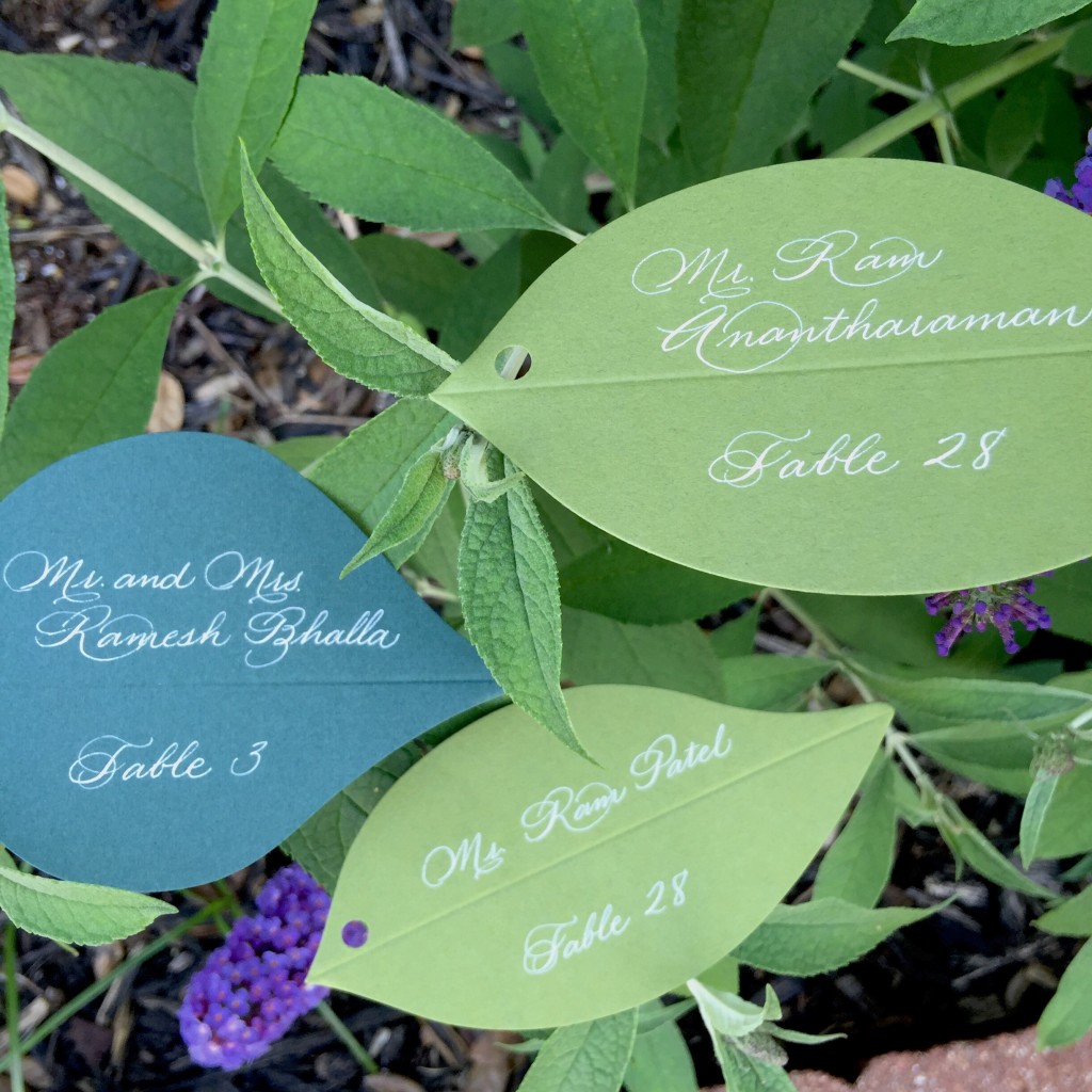
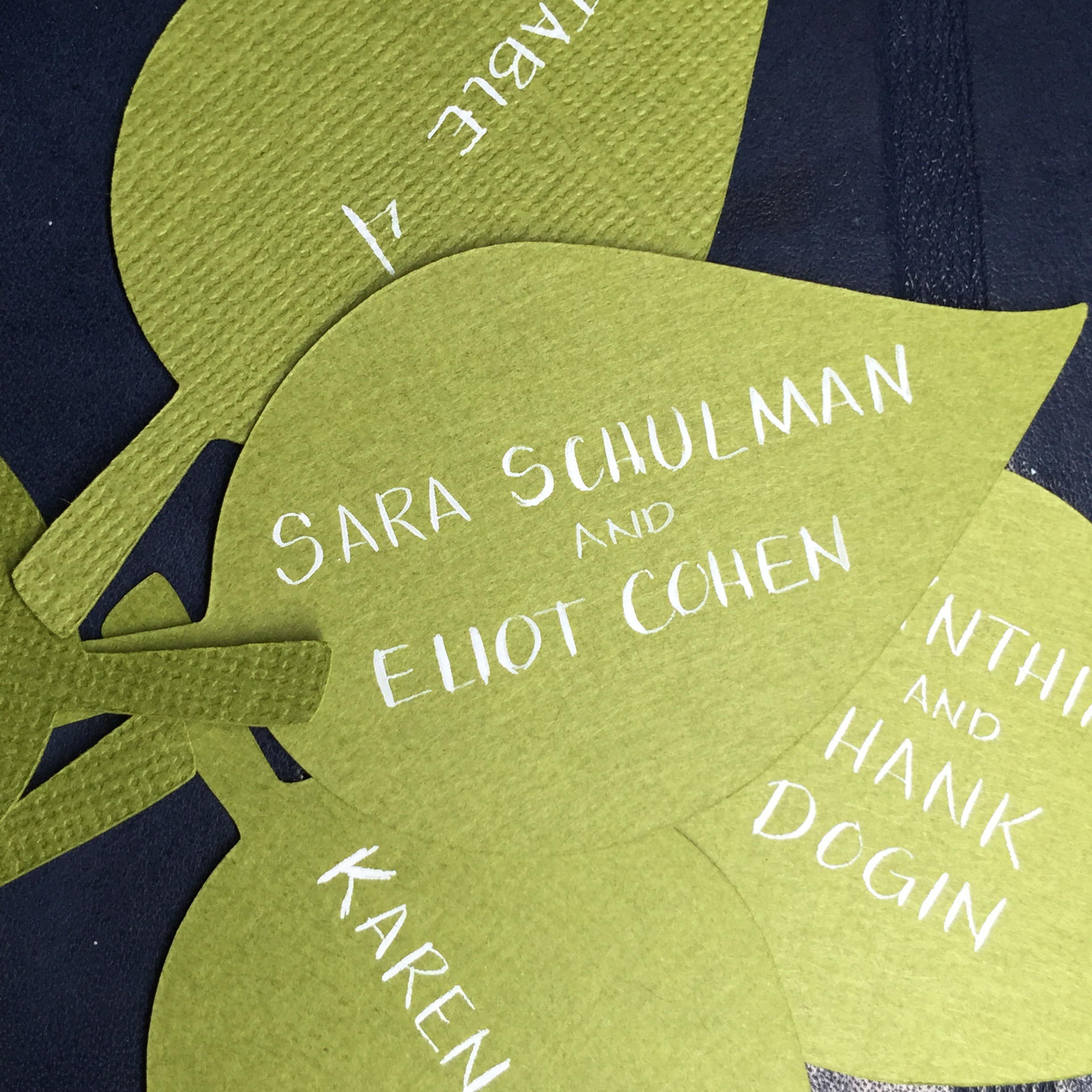
Leaves have been a trend this year for calligraphy seating cards and they can be done so many different ways! I think that white looks best on the green to provide the most contrast and easiest to read when the mass of people enter the reception space. This first one we did tall capital letters to keep a modern and clean look for this fun mitzvah celebration. These were pinned onto golden apples to show people to their seats. Lovely!

traditional seating card calligraphy
This second set were handing from a floral tree (how marvelous) for a wedding reception. They were folded to provide dimension but it was important that we keep everything on one side for this project. So we used my zanner calligraphy hand in white ink and put the name and table number on the same side. Let me tell you – this was tiny writing when we started getting 2 full names on these. Since this was a large wedding, the tree was really full with all the beautiful leaves!
