Well, most of you are probably familiar with the new look as of May, but I am thrilled to introduce you to my new and updated website. She is clean and easy to use and bright and shiny!
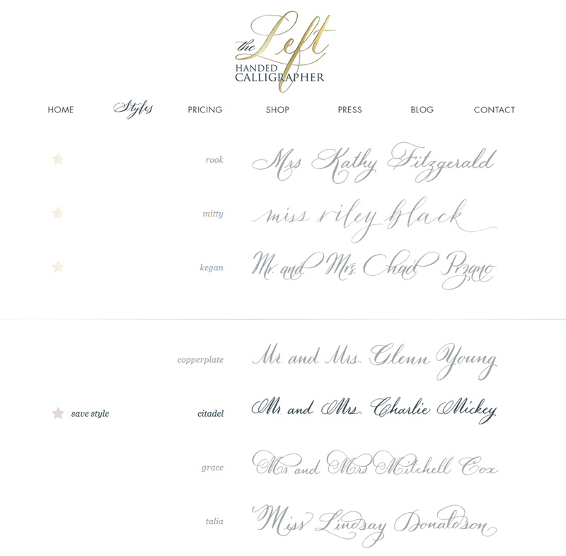
To show off a few of the newest features – my favorite page is the new styles page! First of all, you now have an option to save a style to compare to other styles right next to each other. This is awesome!

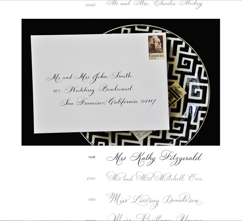
You can also click on the style itself to open up to a photo of it on an envelope. Also, really cool so now you can see more of what the lettering looks like in a group for addressing.

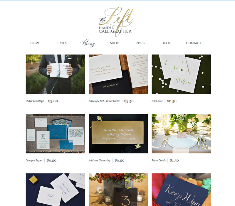
The next page with a total make over was the pricing page. All the rates are the same, just with more photos so you can see what centering is and place cards verses escort cards. There is a more extensive pricing list as well for the design pieces now highlighting the invitation components and bride and groom name in addition to menu, program and invitation design.

The shop had a major overhaul also with a easier to use interface, faster checkout and more photos and products! The bottom of this page also has a few great resources: the guest list templates as well as a new FAQ’s sheet to help answer some of the most common questions burning your brain at 2 am.
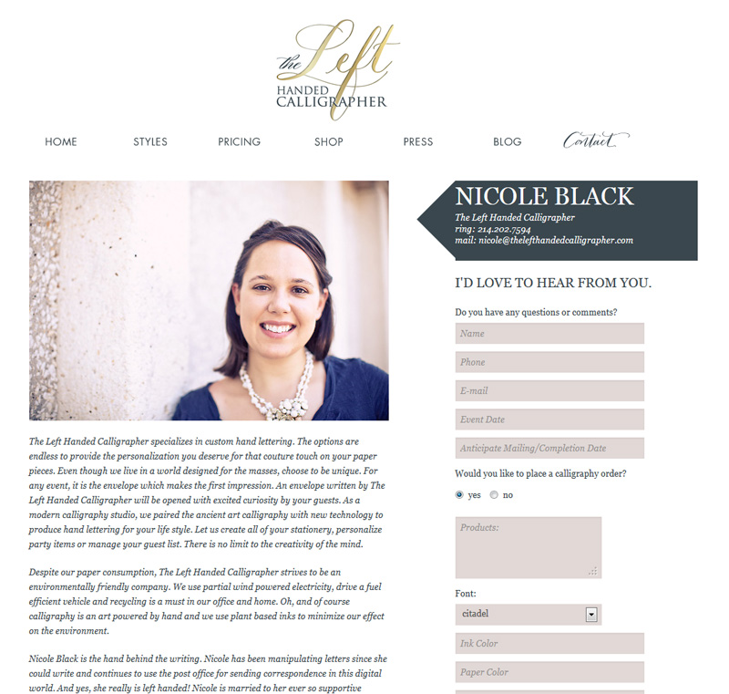
Finally, the contact page has an extensive questionnaire to make the custom ordering/quote process so much easier by asking all the questions I need answered. The goal was easier and faster for my clients and I think we accomplished that 🙂

Oh and did you notice the new colors – GOLD! Love the updated look and clean lines of everything. This is one to hang around awhile 🙂
Many thanks to the photographers who generously allowed me to use their work (see credits on site) as well as Alison with One and Only for designing this beautiful website. (USE her – Alison describes her self as a “web designer for people who make things” – she is perfect for understanding the small business of selling).