I fell in love with a soft grey color created to match a client’s William Arthur invitations recently. It is so soft and cozy looking, and reminds me of a cloudy day. The copperplate font is used on ecru envelopes in a mix of black ink and white gouache. They were stunning.
Archives for November 2008
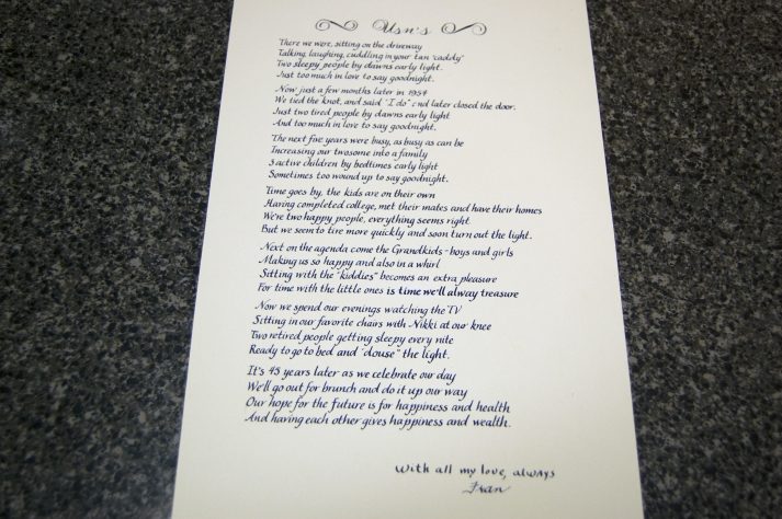
Anniversary Poem
A client of mine asked for a poem to be written out to be framed with some pictures for his father. The poem was an original by his mother to his father written on their 45th wedding anniversary. I thought it was just too sweet. We chose a blue ink using an easy to read […]
Bar Menus
Calligraphy is not only for addressing envelopes. My lovely Chicago mother of the bride came to me the week before the wedding because they decided to have a specialty drink served at the reception and wanted to provide a bar menu. We did four identical menus in gold ink and the citadel alphabet. They turned […]
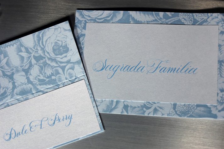
Bridal Blue Placecards
Another Chicago bride needed placecards for her fabulous wedding. The most perfect blue tented cards were found and I wrote in black ink. After my work was done, the mother of the bride placed rinestones at the bottom that helped the cards sparkle in the candlelite. They turned out beautiful and when I get the […]
Black and Silver
I had the pleasure of addressing lovely invitations for a local wedding. Silver ink on black paper is just about the most beautiful effect for an elegant evening formal event. I also was asked to address the return address which turned out fabulous and to stuff and mail the invitations. Looks like this was a […]

